Tenets
There were several objectives I had from the outset that I knew Scenic needed to follow to be successful:
- Framework Agnostic - can be used in any software stack
- Installation and Build Process – must be easy to adopt in any existing or new software applications. Individual applications using the design system need to know when and how to upgrade to later versions
- Open-Source Mentality – developers have agency to contribute changes or new components
- Documentation – every component needs documentation that is up to date and provide actual examples for developers
- Flexible Design – branding (colors, fonts, spacing, etc.) can be changed at build time or run time
- Modular and Scalable – components and CSS must be separated enough that they’re easy to debug, change, or remove if necessary
- Testing – automated testing needs to be implemented to ensure adherence to rules and to ensure changes don’t break past functionality
Framework Agnostic
While the first application slated to use Scenic was built using Vue.js, I knew that wasn’t always going to be the case. We wanted to make sure that we planned for any software framework that was available now or in the future. Thus, it was important that Scenic worked with raw HTML and CSS first, and then be adapted to required frameworks after. The idea was that we’d have a core package that would be used as a dependency of any framework-specific versions of the library. A developer would be able to add cnk-html or cnk-vue or cnk-angular (cnk is a shortened version of Scenic) as an NPM package to their project to have access to all the components.
Installation and Build Process
We elected to create a monorepo, along with lerna and npm to manage the individual packages required for Scenic. The individual packages, along with their descriptions, follows:
Core
The core package contained just the CSS and the fonts. If all the developer was creating was a plain HTML project, this package was all that needed installing. Vanilla JavaScript was not included at the time, since we had no projects that were in HTML. But the documentation included instructions for what JavaScript would need to do in each component. The idea was that we’d write the cnk-html library when it was needed.
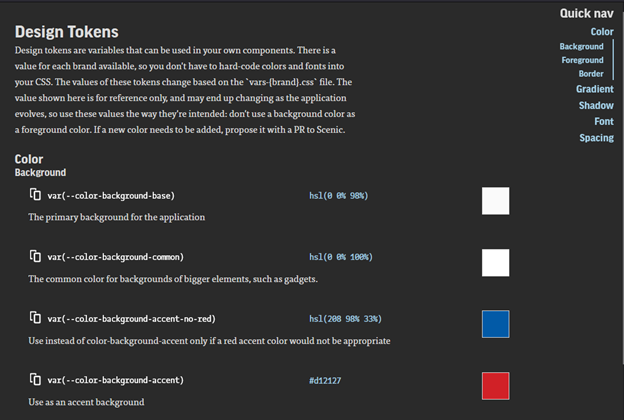
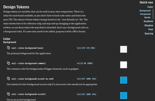
The core package also hosted Style Dictionary, a library made open source by Amazon. I used Style Dictionary to manage our design tokens. Design tokens were the tool we used to allow for branding changes at run time – this not only included colors and fonts, but also string replacements for when the company or product name might be used in the text of the product itself.
Style Dictionary takes JSON-defined key/value pairs and outputs them to a wide variety of output formats. As an example, we had a token called color-background-base – as you’ve hopefully guessed from the name, this is the background color for the base of the application.
When a developer needs to add a color in CSS ad-hoc (not in a component), they use the design token, rather than the color value itself. Thus, if the color value ever changes – due to a change in design or branding – there’s no change that needs to be done to the CSS itself. The new definitions for the values of those tokens are updated in the design system automatically.
CSS
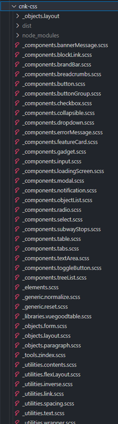
The CSS package was used as a dependency in the Core package. This packaged used SASS due to its ability to include CSS partials. Each component had a CSS file dedicated to its styles. If there was a style to change or add to the Button component, the developer just needed to look in the file entitled _components.button.scss. The underscore at the start denotes a partial. The word “components” is part of Harry Roberts’ ITCSS methodology which helps to ensure styles are loaded from most general first to most specific last.
Many of the values of the CSS properties (colors, fonts, spacing, etc.) were design tokens, as described above.
Docs
I read a Tweet once that said, “Components don’t exist if they’re not documented.” If a developer can’t find a specific component in the documentation, they’ll create their own version of it. Our documentation site needed to be a living document that changed with the state of the components.
In the top left corner, the user was able to see which version of the documentation they were viewing and switch to older or newer versions. They were able to switch between which Framework they were viewing, which changed some of the documentation and changed the code output. They were able to switch between to brands – Martello’s brand as well as one of our common white label brands. Lastly, there’s an option to switch between Light and Dark mode for the site. Please note the documentation site does not, itself, use Scenic as a design system.
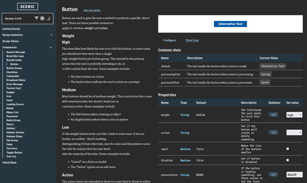
Developers could come here to read about the use cases for different components, as well as have a live, interactive playground to test their components. By modifying the options under the component, the component would update their changes and output the proper code. For example, the default text on this page for the button is usually “Save”, but I’ve modified it here. Clicking on “View Code” shows the Vue code for the button with its options.
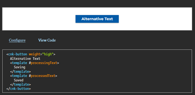
If I change the framework to HTML in the top left corner of the page, the View Code window changes as well.
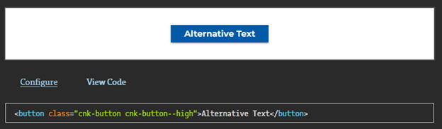
The code snippets are generated automatically for the developer.
The documentation itself is stored alongside the component file (shown later). Automated testing ensures that the project can’t build a component if it doesn’t have any associated documentation. A checklist in the Github commit template also requires the developer to indicate that they’ve added documentation when necessary.
Icons
We elected to use a purchased icon set for our project. Streamline Icons has thousands of icons available. Of course, we didn’t need that many. Our icons package looks through a list of required icons, and automatically compiles them into an SVG sprite sheet. SVG icons, as opposed to font icons, are easier to manipulate, break less often and are often faster to load. Icons were only added on an as-needed basis.
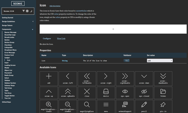
Framework Specific
A framework-specific implementation (Vue in this case) of each component was created. As mentioned above, the component itself had the documentation alongside it. The main paragraph text was a separate README.md file, and a library called vue-styleguidist allowed us to read JSDocs style comments from within the Vue components to generate the documentation for the individual options.
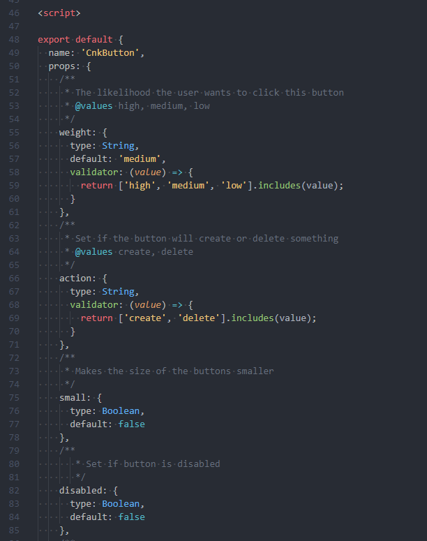
Looking back at the example page for Button in the Documentation section, you can see these comments added. These comments and the README for each component were compiled into a large JSON file that was read, interpreted, and rendered by the Documentation site.
Example Site
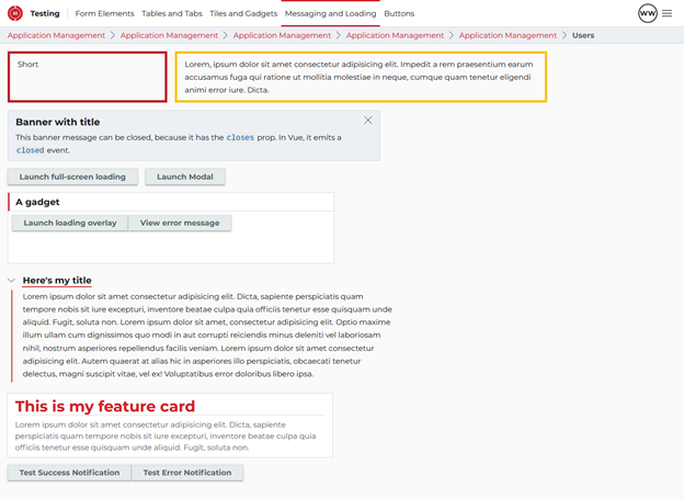
Lastly, we have a stand-alone project that shows an example of each component. There’s a lot of cruft text in place, but we can use this as a playground to ensure components are working the way they’re expected to.
Open-Source Mentality
While Scenic is not an open-source project, I wanted to foster an open source mentality. The repo and commit processes are set up so any developer has the agency to add or change components as needed. The way I see it is this: I’m not a perfect developer or designer. I don’t know everything there is to know about accessibility. There are parts of the documentation that might be unclear. Thus, when one of my teammates can improve on something I’ve built, or can build something new that they need, I should do what I can to invite developers to contribute as much or as little as they want to.
What I Would Change
If I could go back and start this project from the beginning, I would have used web components as the basis for each component, rather than starting with Vue. As I said, the first project using Scenic was a Vue project, so it made sense at the time. If I had used web components as the primary method of creating components, I could then have created a Vue wrapper (and then an Angular or React) wrapper around each component. It would have made the initial work a bit longer to get it running in Vue, but would have made it easier to then onboard new frameworks. It’s also likely that in some circumstances, a change to a component would only have to be made in one place, rather than in each framework version of the components.
In addition, while there was some testing for things like ensuring components were documented properly, and that every design token had a value in each brand, there are other types of testing I wish I had added. For example, I never got into things like visual regression testing to do automated visual differences on each component to make sure the CSS hadn’t broken things in unexpected ways, or testing to ensure that the core functionality of each component remained unchanged at each build. While we never ran into these issues in a major way, additional test suites would add peace of mind to the stability of the project.
Summary
Scenic is a very robust design system, built in response to the flaws of my first design system. I consider the project to be largely successful in meeting the goals I had set out for it. I certainly had help from some of my co-workers along the way – particularly in the build pipeline. But this is a project I’m proud to put my name on. I learned so much along the way, and I’m keen to bring a robust design system to other applications as well.