All of the following case studies took place at Martello Technologies between 2015 and 2022. Martello has always been in the business of monitoring telecommunications networks. When VoIP and network calls are of poor quality, the goal of Martello's software is to tell users where and why the problem is occurring. I was hired by Martello to accomplish two major issues they were experiencing:
They didn't have anyone advocating for the customer during the design of features
Their CSS was out of control
The following case studies show a select few projects I did to help solve these problems.
Case Study #1
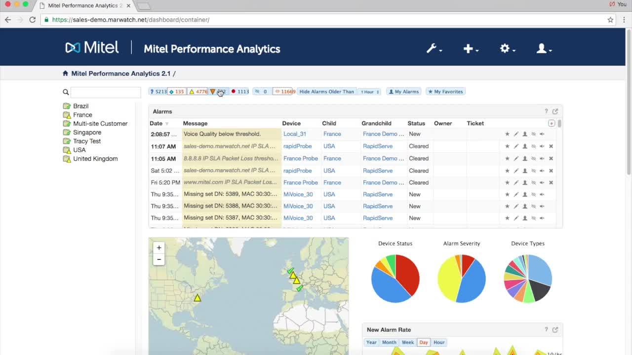
This is how the product looked when I was hired. Images can be clicked on to zoom in.
This was among my first projects at Martello, working on their flagship product—a white-labeled application called Mitel Performance Analytics (MPA), which was created in 2008. I ran some user experience tests early on in my employment. I uncovered two main issues in that initial research. First, new users to the product were finding issues understanding how to navigate the application. Menus at that time were only represented with icons. It made it difficult to understand which menu to open to get where they needed. The second issue surrounded the data that was on the main page. The visible pie charts you can see were neither readable (too many slices) nor useful to the customer.
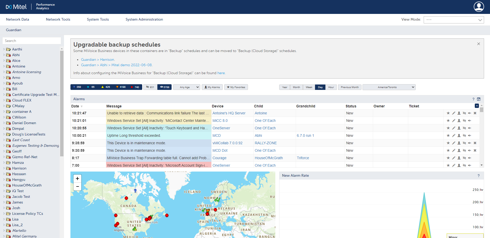
This was my initial overhaul of the home page for MPA customers.
I led an exercise with a few team members to compile the entire list of pages the user could navigate to, and find meaningful ways to sort them to clean up the main navigation header. I got rid of the margins on the left and right, as well as made the main header shorter to be able to add more meaningful information to the page. Lastly, I removed unnecessary data from the main page to provide the data our customers identified as most useful to them.
New users were able to navigate the product more easily, finding the product features they needed the most more quickly. Additionally, users were more likely to isolate problems from the main page by having the most relevant information available closest to the top.
Case Study #2
The team I was a part of was given some leeway to try a new project, which was called Vantage. I was responsible for directing the user experience, data visualization, and the design system implementation. MPA, the flagship product mentioned in Case Study #1, is a large software offering that has a lot of functionality. We wanted to pare that experience back to the core that made it appealing and have it not just focus on Mitel products, thus removing the white-labeling. The core experience simply revolved around giving the customer answers to some simple questions:
Are there problems with my network calls and/or network services (e.g. Microsoft Teams, connection to ISP, connection to a web service like Salesforce)?
Who is having those problems?
How often are these problems happening?
Where on my network are these problems happening?
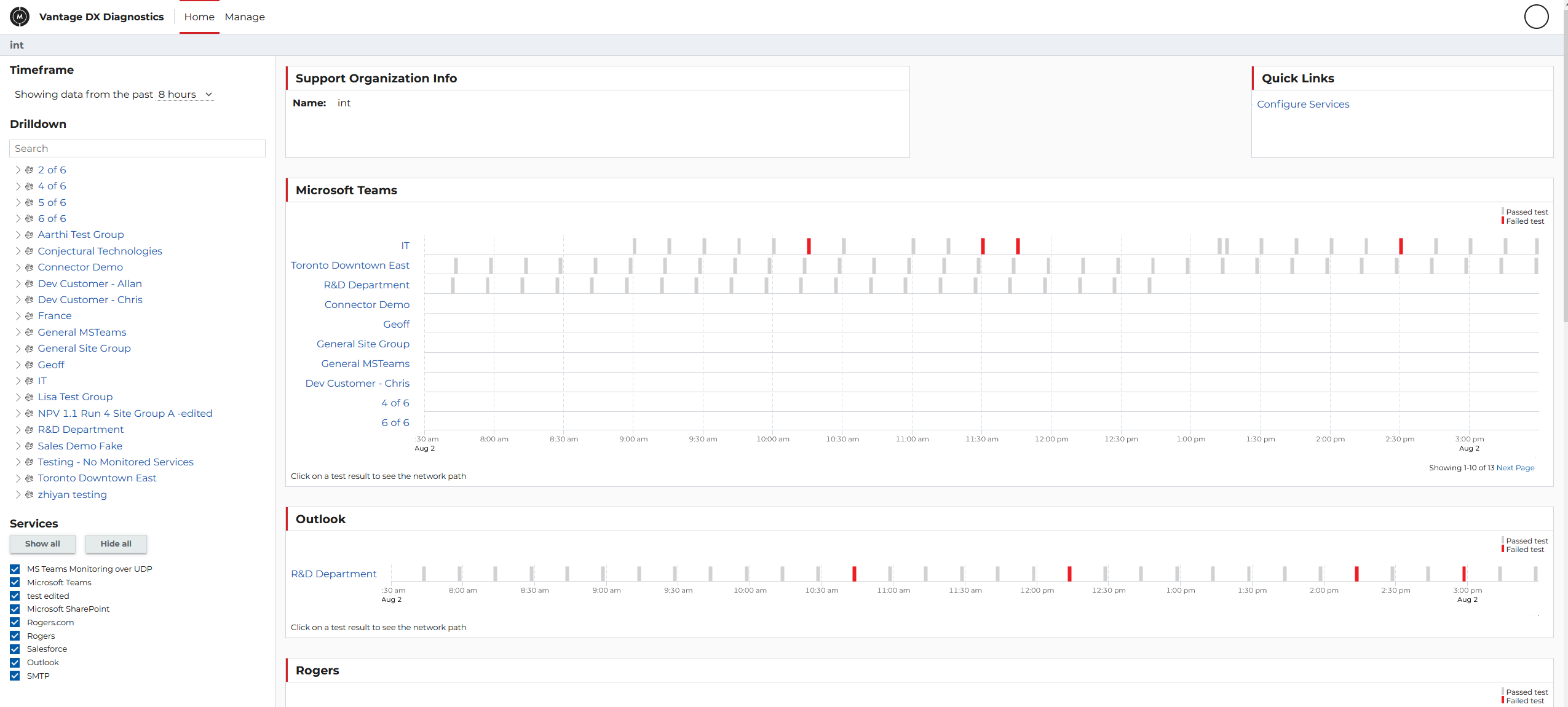
This is what the users see on their main page.
The way we accomplished this was to have the customer install a small probe at the location their users were in. The probe ran regular connections to the destinations as if they were a user. In this first screenshot, the user gets an overview of the test results. I used grey for passed tests and red for failed tests. Some people on my team wanted to use green for passed tests, and I argued for a light grey for a couple of reasons:
There can often be some issues for some colorblind users if red and green are used.
Green calls attention to itself needlessly. When things are working properly, we don't need the user's attention.
After user research and A/B testing, we decided to highlight only the problems that required the user's attention. Users could click on problematic tests (or non-problematic ones if they wanted) to see where the issues were. The following example shows what happens if the user clicks on the first red marker in the first row (leftmost beside IT).
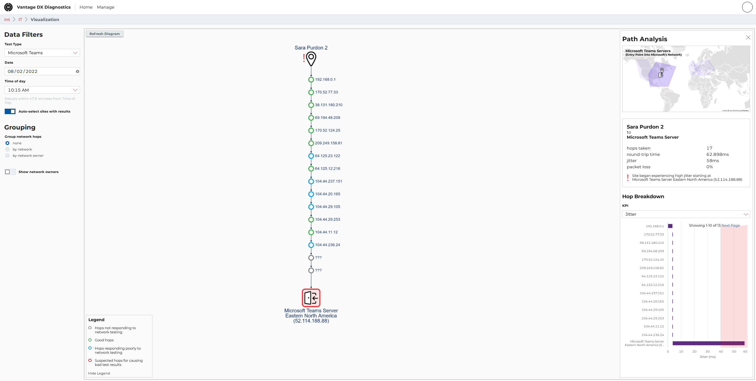
This route shows all of the nodes between the user and their destination.
In this example, we can see that there are some minor issues along the route (denoted by blue marks on the network path), but the software suspects the issue lies with the Microsoft Teams server, due to high jitter (denoted by the red outline at the final point in the network).
As I said, MPA is a very large software offering, and we were able to strip out a large bulk of the product into something more minimal with a broader appeal to more users. Our research showed a higher willingness to use the product compared to the old software. Users were able to identify issues more quickly and get to the root of their network issues more easily. This resulted in saving money for our customers by providing evidence of who was responsible for the network issues (allowing for Service Level Agreement refunds from ISPs for instance) and reducing the amount of time to solve issues.
Case Study #3
A major portion of my time on the project above in Case Study #2 was the design system I implemented, which I called Scenic. I have a more in-depth study on Scenic available at the bottom of this page. The design system was encompassing everything from the broader CSS for our applications, to the component library being imported into projects, to the documentation and code examples developers could use.
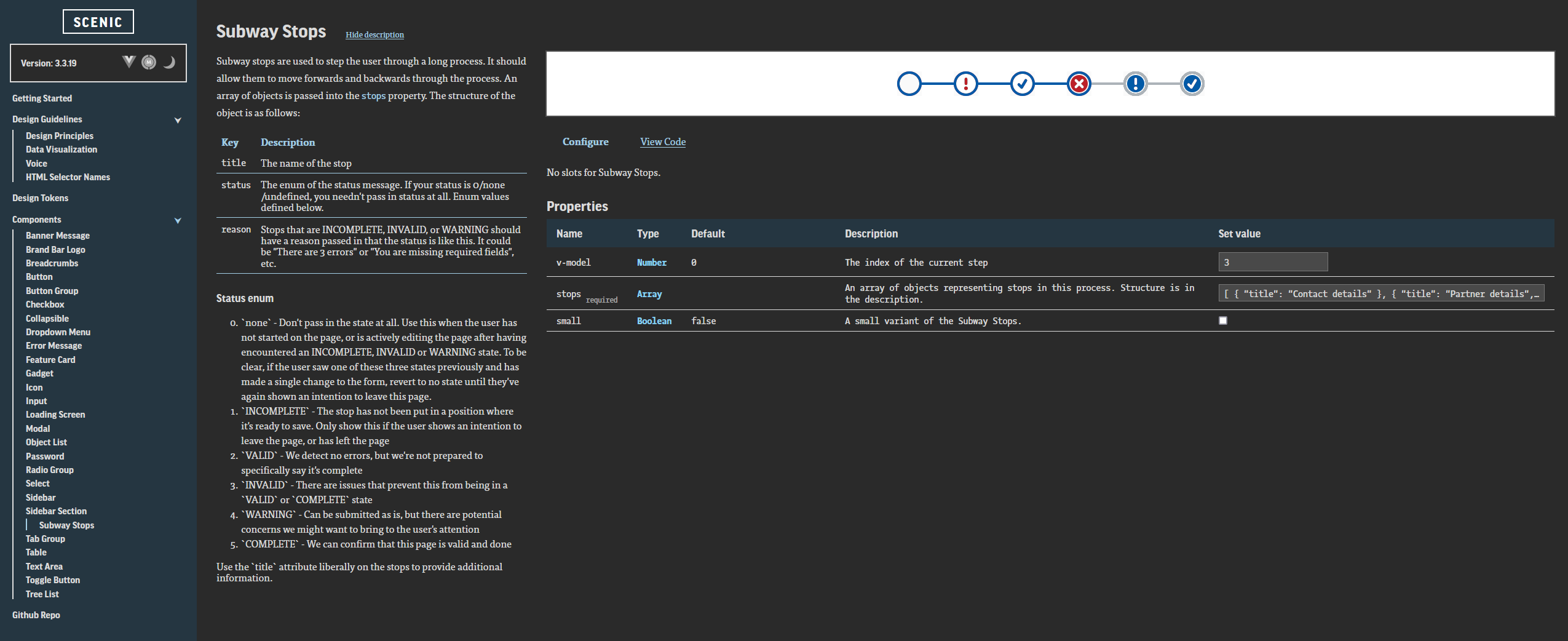
This is the Subway Stops component from the Scenic Design system. Note that the documentation page itself does not use the design system for its own styles. The preview in the top right shows the component as it would be in a project using Scenic.
When a developer needed a component, they could navigate to the Scenic documentation site. They could find the list of components available in the application, and in the case of a Vue project, could see all of the props and slots available to them for that component.
Every component was documented with use cases, examples, and a preview window to show what the component would look like in the application. Users could change the properties live in the documentation site, and then copy the snippet that they would need to paste into their own code.
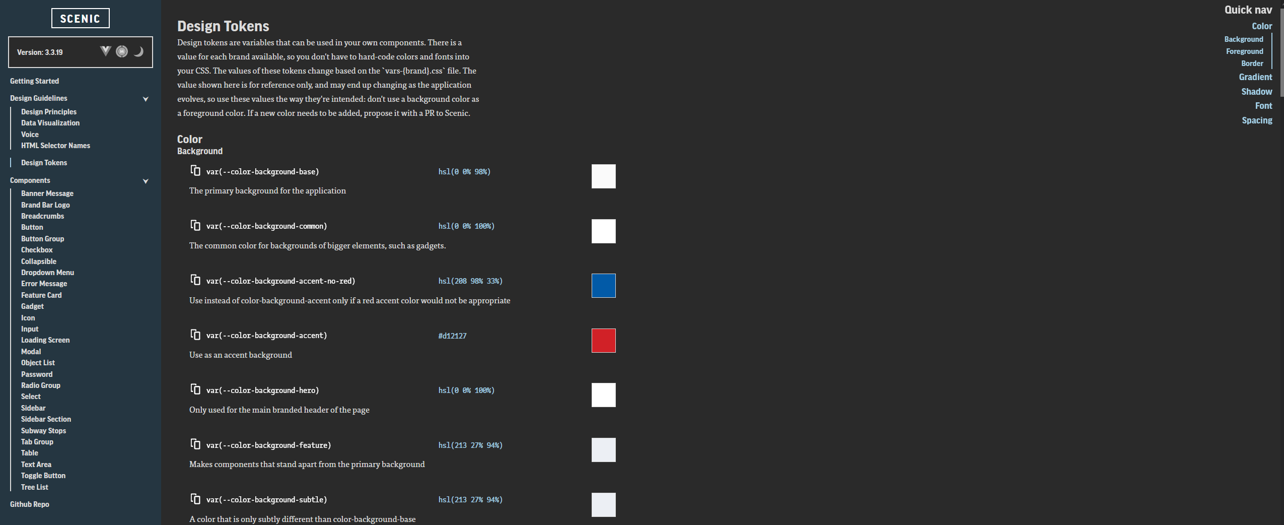
A few of the color design tokens included in Scenic.
When working on the design of items not in the component library, developers wouldn't use hard-coded values for things like colors, sizes, font weights, padding, or margins. Instead, they would use design tokens. Design tokens were centrally managed from Scenic. If a color needed to be changed, or a new theme added, or a product needed white-labeling, the tokens ensured that no changes were required in the codebase of each individual product relying on Scenic. Although we had no native applications, the design tokens would have ensured that color values were consistent across any platform, without developers ever having to update those values manually.
Comments within the component file, as well as a README file alongside the component, allowed the documentation site to be generated dynamically.
Unit testing using Jest ensured that when new components were added, documentation had to be included. Props and slots were included via comment blocks inside the component file. A README file provided context for the usage and details of the component. These comments got parsed at build time to generate a JSON file that was read by the documentation site, ensuring the documentation always matched the component files.
Developers found Scenic easy to consume while writing their applications. When issues like accessibility came up, Scenic allowed us to change code in one place and have it propagate across any projects relying on Scenic, usually without any changes being made to the project codebase (apart from updating the npm version). We were able to have our default branding, as well as a white-label branding that could be switched with one line of code at runtime. Scenic achieved all objectives it set out to accomplish. As mentioned above, you can read about Scenic more in detail. A link is provided at the bottom of this page.